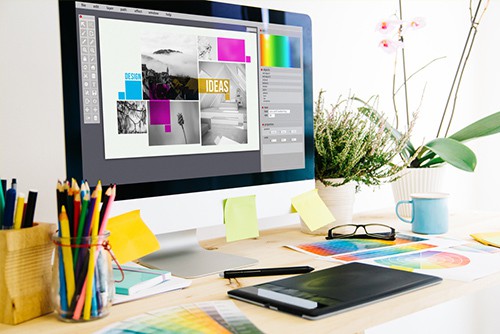
Want to make the right impact with your marketing? Check out our common graphic design mistakes for tips on what not to do!
Wrong Typography
Be cautious and aware of what fonts you are downloading from free websites. The last thing you’ll want is to get tied up in a legal battle because of a free font you downloaded with restrictions.
Typography is a very important element in your design. If you make poor choices, it can be devastating to your project. Using illegible fonts or type that does not match the feeling of the content will not have the lasting effect that you are looking for. Use fonts that hit all the “feels” you are looking for. Be aware of the thickness of font against the background. Lastly, make sure to create enough contrast between the font and background so that all your words are easily read.
Font Explosion
Too many typefaces can give your design a cluttered or confusing appearance. As a general rule, try to stick with two different fonts and use different font weights to highlight areas. This will help to keep your overall look consistent.
Files Saved Incorrectly
In general, your designs should be saved as CMYK for print and RGB for web and digital output. Knowing how to set up your files correctly from the start is extremely important. Print work is set up as CMYK and at 300dpi, whereas work for the web and digital should be RGB (resolution will depend on the output but usually is 72dpi). Other considerations are the bleed, trim and safety areas. Before sending to print, make sure your file format is set up correctly. Learning these processes will save you time in the long run and ensuring your work is reproduced correctly.
Failing to Proofread
This is probably the most common mistake made by designers. They get rushed and forget to run spellcheck or read through the content. Spellcheck is great for finding misspelled words but it won’t catch words spelled correctly in the wrong context (for example: there, their and they’re). This is one reason why you should always proofread every piece of your work or have someone else go through it.
Typos are a designer’s nightmare. Not only are they unprofessional, they are also very embarrassing and can be very costly.
White Space
Most designers know to use space, but still fall into the space trap because they are trying to get too much information into one space. The result is a cluttered mess that only hurts the design project.
Give every element room to breathe, otherwise everything runs together. White space creates contrast. It guides people’s eyes in a particular direction, and establishes a clear visual design.
With decades of experience, the Midwest Marketing graphic design team has produced award-winning creative that gives every message a vibrant voice. It begins by pinpointing the most effective brand messaging for our partners and creating visual concepts that inspire action. Needing to get some designs made? Reach out to us! 605-716-5666


