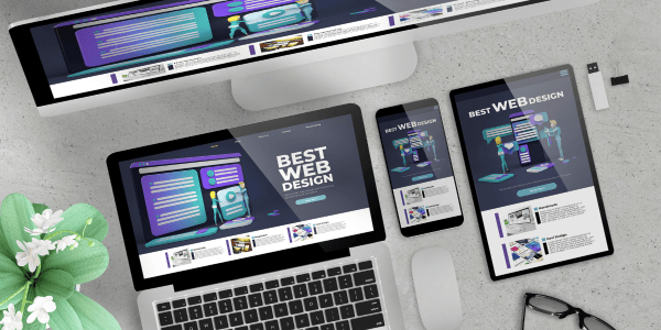
Your website serves as your 24/7 online storefront, so it’s crucial that it makes a positive impact on those who visit it. If your website’s not effective in attracting and retaining traffic, it can mean huge losses to your bottom line. Luckily, we’ve compiled 9 easy tips for improving your website design so you can elevate your online success.
1. Keep Your Homepage Simple
Since the homepage is often the first page a person visits, it may be tempting to cram as much information about your products and services as you can on this one page. However, doing so can overwhelm your visitors and lead to them leaving your website, increasing your bounce rate, and decreasing your authority on Google and other search engines.
When planning what to put on your homepage, it’s best to think of your overall goals and only include what’s important to your business. Use high-quality graphics to tell a story versus blocks and blocks of text, and include menus and links to guide your customers to internal pages on your site.
2. Place Important Content Above the Fold
What is above the fold, exactly? Above the fold refers to what a website visitor sees before they scroll down on a page. Make sure to include your main message and call-to-action high up on your landing page to ensure maximum visibility and increase conversions.
3. Add White Space
Again, going back to the overwhelming your website visitors – if you don’t include white space on your web pages, your site will appear cluttered, and your traffic will vanish. Make sure there is enough blank space between elements, which will make your website look more professional and easier to read.
4. Break Up Text
The sight of a huge, long paragraph can be cumbersome for even the most avid of readers. Make sure text throughout your website is concise and include only 3-4 sentences at most in each paragraph. Bulleted items, subheadings, and images are also great ways to make your content easier to consume.
5. Keep Fonts Consistent
Don’t let your website become a hodge podge of dozens of different kinds of fonts – instead, pick a few fonts and use them consistently throughout your website. If you use different fonts for headings, image captions, and paragraphs, make sure to use the same font for that element everywhere on your site.
6. Consider Your Color Scheme
Having a consistent color scheme can go a long way in making your website visually appealing and professional. Incorporate colors from your logo and complementing tones to really drive home your brand’s identity.
7. Have a Goal for Each Page
Each page of your website should have its own unique goal, as well as have its own topic. Limiting each page to its own topic helps with reducing clutter and makes it easier for visitors to read through your content. Of course, you’ll want to ensure there are links and ways to get to other relevant pages so you can help guide your visitor throughout your website.
8. Choose Your Photos Wisely
Professional photography and graphic design can be expensive, so it’s understandable if you need to throw a stock image or two on your website. However, the best way to do this is to only use stock images of generic items and scenes, and to avoid using stock images that include people in them.
Including photos with people in them is definitely recommended in order to provide a more trusted, professional feel for your customers, just use ones that include actual members of your staff. A page dedicated to introducing your team, with high-quality photos of each person, is also highly recommended.
9. Be Mindful About Directing Traffic Off-Site
While it is great to link to trusted resources, partner sites, and your social media profiles, keep in mind that doing so is to risk losing your valuable traffic to another website. Make sure you only link off-site strategically and set up the link so that when it is clicked, it opens in a new window so that your visitor can easily come back to your website later.


